
Redesigning a Quote Experience
Roles:
Content & marketing strategist
UX writer
Editor
Team: AAA Life Insurance Company
The challenge
After launching AAA Life’s expedited life insurance experience (ExpressTerm), we noticed a sharp increase in abandonment on the quote results page. Unqualified users continued past the page without completing their applications to price shop.
Each application required significant time and effort to review and process. The increase in unqualified applicants was causing a strain on business resources.
The solution
We created and tested new page designs to improve the pool of qualified applicants, reduce the strain on business resources, and increase application completions.
Context
When we presented a user’s quote as a range rather than an exact estimate, we found that users were more likely to abandon the process because they were confused or felt the range was too broad. They’d proceed with the application for a more accurate price with no intention of completing the process.
User research validated that the design of the quote page was causing abandonment and price shopping.
Four designs were subjected to a two-phase user study involving qualitative and quantitative user research. Shortly after, the winning design was implemented.
Design
First, we partnered with our IT and product teams to figure out a way to introduce a monthly payment estimate that was much closer to the customer's true rate. This is referred to as the monthly estimate.
Example: An applicant in good health can pay as little as $8 or as much as $50 a month for life insurance. An applicant's actual monthly payment is determined during the application process and typically falls somewhere in the middle.
To provide more context, we decided to present this monthly estimate in the middle of the user's monthly payment range.
By showing the minimum and maximum someone might pay along with their estimate, we hypothesized that users would be more likely to start an application if they liked their estimated rate.
We also hypothesized that we'd see an increase in the quality of our applicants as price shoppers would see their estimated rate and abandon before starting an application.
Armed with this information, we set out to find the best way to represent it on screen. The original screen is shown below for context.
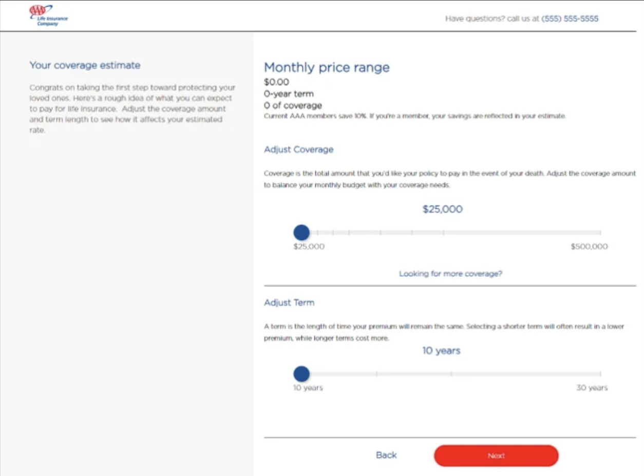
Old ExpressTerm Quote Results Screen
We developed four static designs that prominently displayed the range and monthly estimate. The goal was to emphasize the monthly estimate and showcase how a customer’s estimated rate fell within the price range.
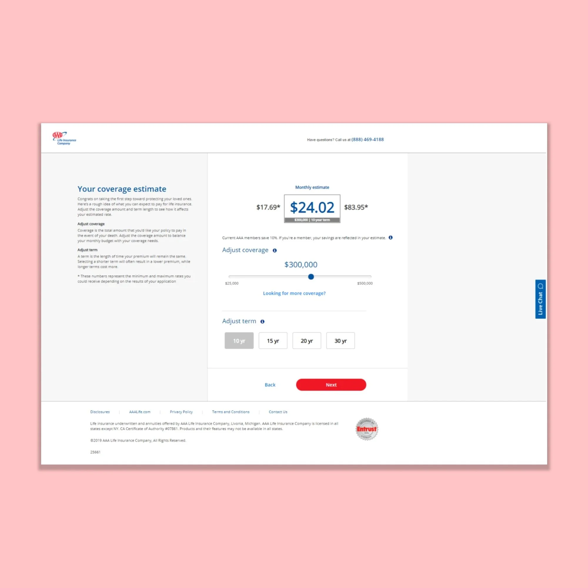
Simple changes to the copy, such as using “Monthly estimate” instead of “Monthly price range,” clarified the design.
I also added help text to the left side of the screen to help users understand the relationship between coverage amount and term length.
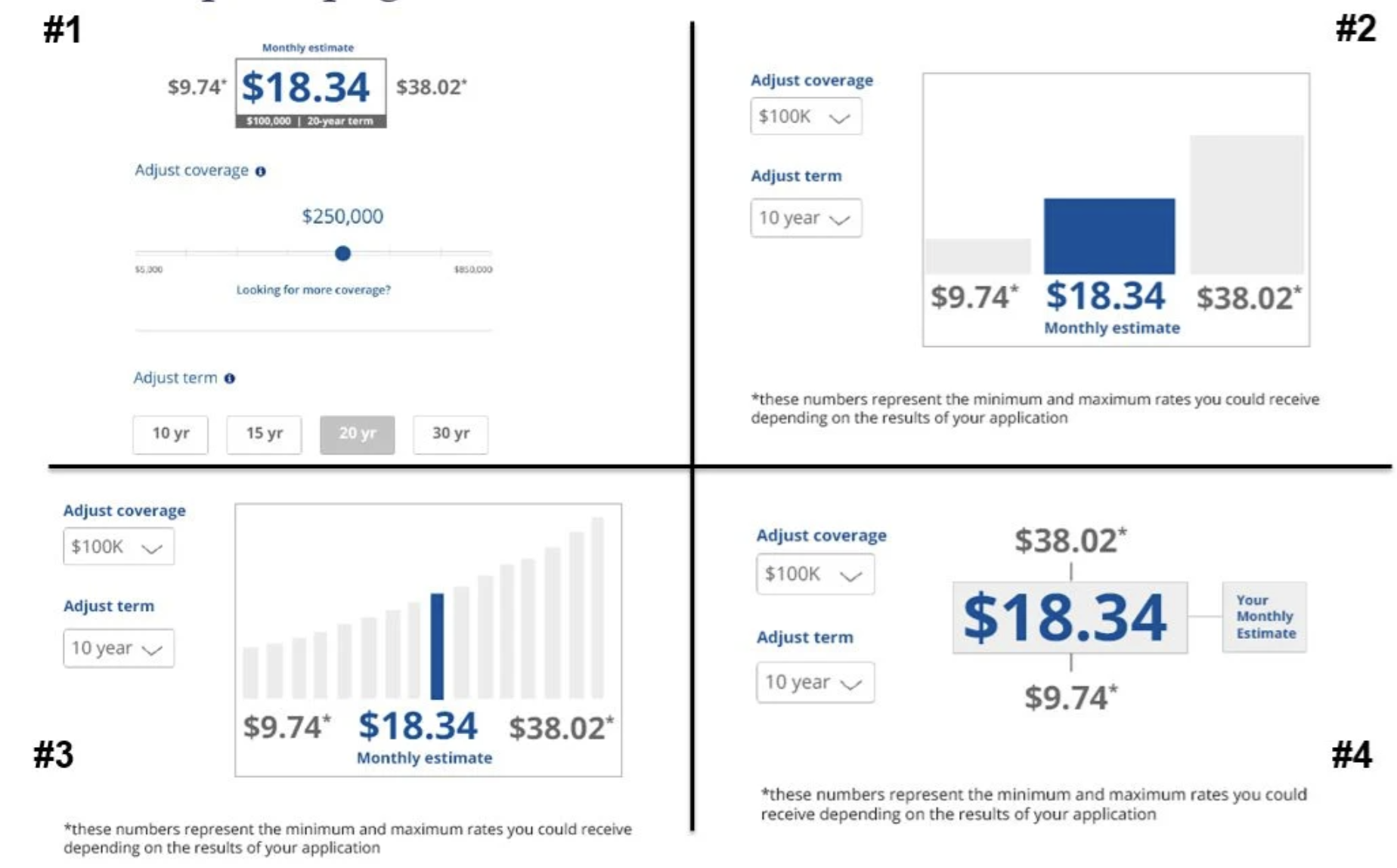
Quote page concepts
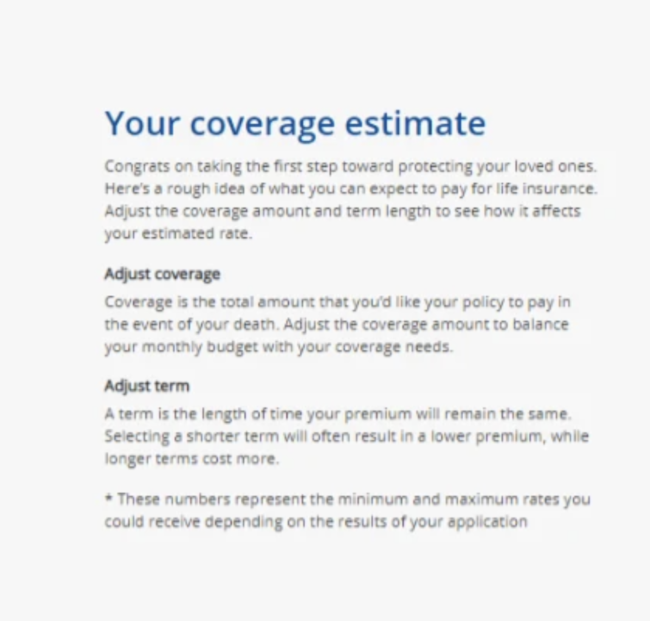
Updated help text
Research
Two phases of research were conducted through a third-party consultant. The primary goal of this research was to determine which of the four designs would most likely meet our goals.
Phase 1
Qualitative: 25 members participated in a survey. They were asked for their opinion on four static redesign concepts.
Concept number one was selected as the winner.
Phase 2
Quantitative: 255 members were shown an interactive version of the winning concept from Phase 1 against the current quote page. They were asked to explain their likes and dislikes of each page and which one they’d prefer to use.
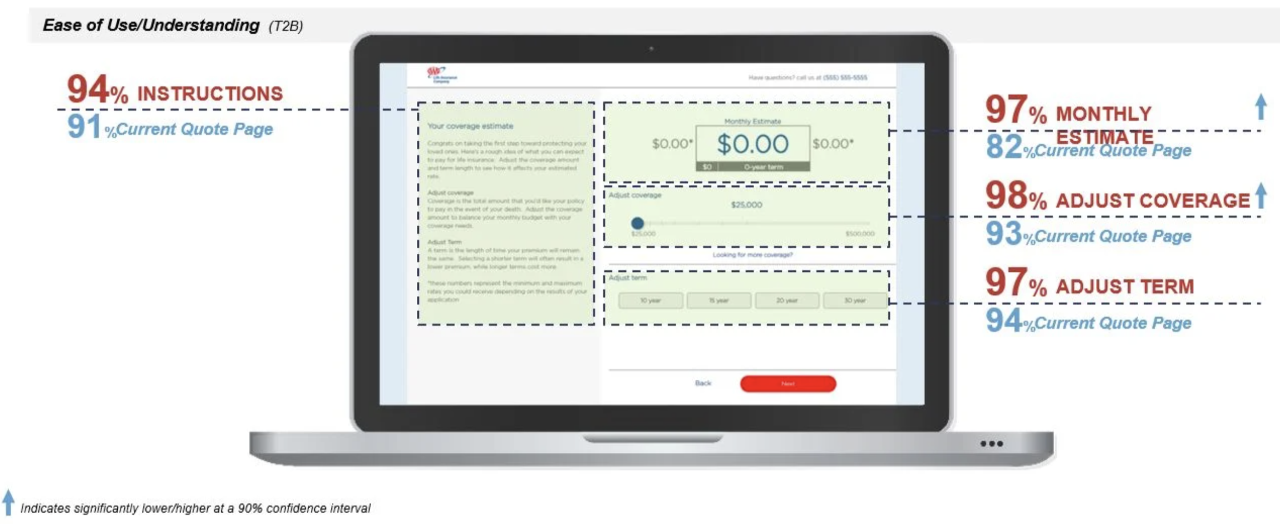
A sample of the survey results is shown below.
This image shows the difference in our respondents' ease of understanding elements on the page when we compared the current quote page to the winning design from Phase 1.
Our redesign of the quote range and my relabeling of “Monthly price range” to “Monthly estimate” contributed to a 15% increase in users' ability to understand the monthly estimate, which was statistically significant.
My adjustments to the help text increased users' understanding of and use of the new page by 3%.
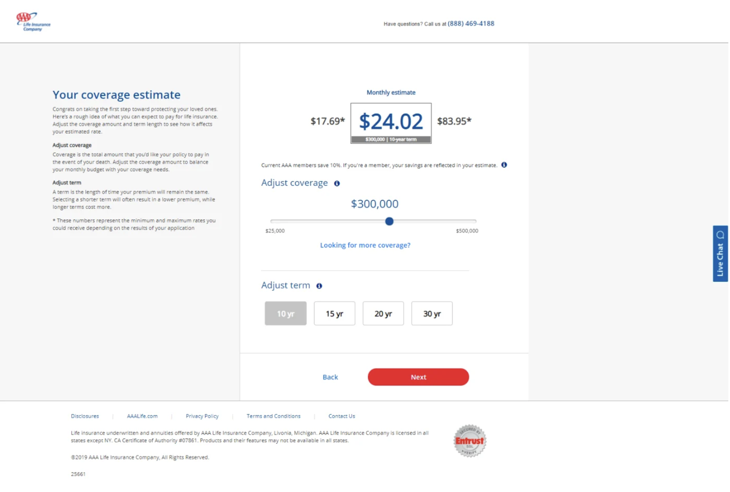
The final design
The outcome
In the month after implementing the new design, we saw a 23% increase in qualified customers continuing past the quote results page. This increase also led to a 6% increase in instant decisions and a 3% increase in app completions.
We also saw a 35% decrease in the cost per decision, which is the total cost of resources needed to review and process an application.
Overall, we created a better user experience for applicants and reduced the strain on business resources.
Results
23% increase in qualified customers continuing past the quote results page in the month after implementation.
35% decrease in cost per decision.
3% increase in app completions of those who start applications.
6% increase in instant decisions.